Field Notes
Observations in the real world
Observations
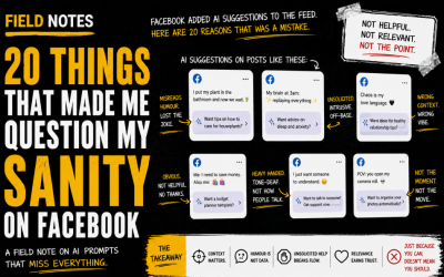
20 Things That Made Me Question My Sanity on Facebook
Abi’s field note on Facebook’s AI-generated feed prompts, using 20 deeply questionable examples to explore what happens when AI is deployed without enough context, humour, nuance or restraint. Description This field note captures Abi’s reaction to Facebook trialling...
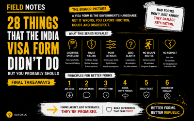
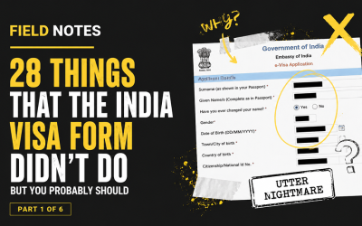
28 Things the India Visa Form Didn’t Do, But You Should
Abi’s field note on what the India visa form gets wrong, turning one painful form experience into 28 practical lessons on trust, accessibility, validation, progress, cognitive load, error recovery and form design. Description This field note turns Abi’s experience...
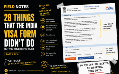
The India Visa Form Autopsy: Final Page, Broken Recovery and Defaults from Hell
The final page should feel like progress. Instead, it begins with a server/page error, locks previous answers in place, breaks a searchable dropdown, assumes answers on behalf of the user, and defaults every additional question to “yes.” A majestic finale, if the goal was despair.
The India Visa Form Autopsy: Personal Details, Sensitive Questions and Dropdown Trauma
Page three is all about the applicant. Unfortunately, it appears to have been designed by someone who believes “personal information” means “ask everything, explain little, and make every country list a scrolling endurance event.”
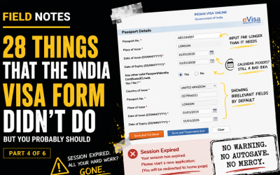
The India Visa Form Autopsy: Passport Details and the Session Expiry Gotcha
Passport details should be straightforward. Passport number. Place of issue. Dates. Done. Instead, we get inconsistent input patterns, another calendar picker, irrelevant fields shown too early, and a session expiry message that deserves its own tiny legal tribunal.
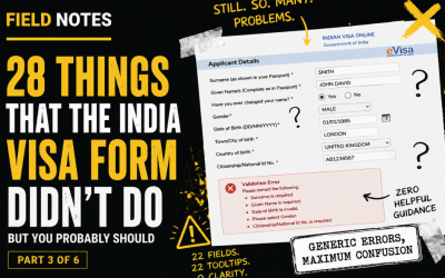
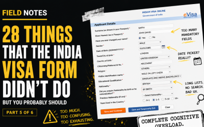
The India Visa Form Autopsy: Applicant Details and Cognitive Overload
Page two brings 22 labels, 22 inputs, 22 tooltips and four CTAs. That is not a form. That is a hostage situation with fields. This post looks at cognitive overload, unclear save behaviour and why “helpful” tooltips should actually help.

The India Visa Form Autopsy: Progress, Captchas and Dropdown Doom
The first page of the form should orient the user. Instead, it gives them no progress indicator, hides preparation information below the form, assaults them with long dropdowns, and then nukes their selections after a failed captcha. Beautiful. In the way a sinkhole is beautiful.
The India Visa Form Autopsy: First Impressions and Trust Killers
Before a user enters a single passport number, the interface has already started damaging trust. In part one of this field notes series, we look at how presentation, hierarchy, outdated cues and unclear reassurance make a legitimate visa journey feel worryingly dubious.

AI is coming to get you
An early 2022 field note exploring what ChatGPT could surface about online shopping behaviour, checkout hesitation, customer dissatisfaction, and the future of ecommerce experiences. Summary This early field note captures Abi experimenting with ChatGPT as a way to...
Let’s Start Something new
Say Hello!
If you’d like to find out what’s killing your conversions, you can contact Abi on LinkedIn