
Find the stuff that’s killing your website conversions.
Got a website that isn’t doing as well as it should? You’re not the only one. I find the problems that nobody else has spotted and help fix them.
What I do
It’s not rocket science. It’s a fresh set of eyes to help you see the wood from the trees.
UX Research
Compatiblity
Establishing how well a product works across multiple devices, resolutions and browsers
Bugs
Heuristic Analysis
Advanced heuristic analysis of websites and apps to establish problematic areas relating to usability
Consumer Behaviour
Understanding what motivates your audience to engage with your product
My humble brag
Days of experience
pounds of lost revenue found
pounds of revenue generated
bugs discovered
Useful resources
A selection of articles, podcasts and more…
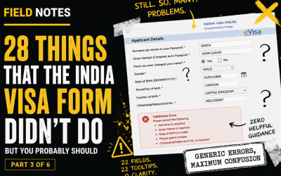
The India Visa Form Autopsy: Applicant Details and Cognitive Overload
Page two brings 22 labels, 22 inputs, 22 tooltips and four CTAs. That is not a form. That is a hostage situation with fields. This post looks at cognitive overload, unclear save behaviour and why “helpful” tooltips should actually help.
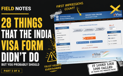
The India Visa Form Autopsy: Progress, Captchas and Dropdown Doom
The first page of the form should orient the user. Instead, it gives them no progress indicator, hides preparation information below the form, assaults them with long dropdowns, and then nukes their selections after a failed captcha. Beautiful. In the way a sinkhole is beautiful.
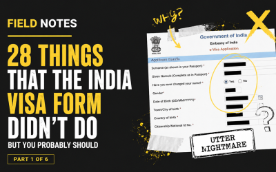
The India Visa Form Autopsy: First Impressions and Trust Killers
Before a user enters a single passport number, the interface has already started damaging trust. In part one of this field notes series, we look at how presentation, hierarchy, outdated cues and unclear reassurance make a legitimate visa journey feel worryingly dubious.
working with Me
I like to think I do a good job, but it’s always better when others think the same.

Want to find out more?
get the ball rolling
You can contact Abi on LinkedIn if you’d like to figure out what’s killing your conversions: