Description
In this video teardown of the Zara website, UU3’s Abi Hough and Zuko’s Adam Winsland take a look what happens when stylistic interpretation trumps the user experience.
Main Topics Discussed
1. Accessibility & Readability Failures
-
Font sizes are too small, with poor contrast.
-
Key content like product information and CTAs (calls to action) are hard to see or recognize.
-
Links often appear as plain text, failing basic affordance principles.
-
Elements like “composition and care” are hidden behind inconspicuous links.
2. Visual Design vs. Usability
-
Excessive white space is prioritized over practical UI elements.
-
Visual hierarchy is inconsistent and confusing.
-
The site appears to be “designed for design’s sake,” undermining usability.
3. Mobile-First Issues
-
The design appears optimized for mobile but suffers on desktop.
-
Important components are shoved to the side or missing in desktop views.
4. Accessibility Tokenism
-
A third-party accessibility widget is used as a superficial compliance fix.
-
This is criticized as insufficient and potentially harmful for assistive tech users.
5. Poor Checkout Experience
-
The entire checkout flow is unintuitive and unnecessarily difficult.
-
Users must click the primary CTA just to see if their size is in stock.
-
Form fields suffer from bad layout, placeholder labels, and unclear validation rules.
-
Issues with phone number input, especially requiring a mobile format with no fallback or help.
-
Payment UI requires users to manually select card types, with little visual clarity or error guidance.
6. Lack of Progress Indicators or Feedback
-
No breadcrumbs or clear progress bar in checkout.
-
Forms give unclear error messages or premature validation states.
-
Confusing dropdowns for expiration dates and CVV2, unclear UX cues.
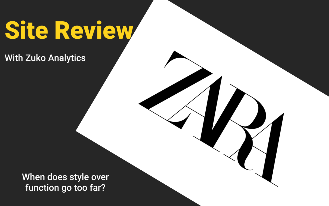
7. Brand Over Function
-
The website favors a high-fashion, editorial aesthetic over functionality.
-
There’s a sense that being “edgy” trumps being usable — which they argue is a serious flaw.
8. Impact on Real Users
-
The site is exclusionary to older users, users with disabilities, and even average users with less patience.
-
They liken it to being asked to “speak another language” to shop.
-
Comparison with Amazon: not beautiful, but highly functional and effective.
Key Takeaways
-
Good UX is boring UX. It’s predictable, accessible, and user-focused — not flashy for its own sake.
-
Visual design should serve function. Fashion-forward or minimalist design cannot come at the cost of usability.
-
Accessibility must be baked in, not bolted on. Tools and widgets can’t replace thoughtful, inclusive design.
-
Design with real users in mind. The idea that “our target user is Gen Z” doesn’t excuse poor readability or usability.
-
UX debt damages business. Despite Zara’s profits, the site likely underperforms compared to its potential.
-
Conversion and usability go hand-in-hand. Clean, simple, usable interfaces almost always convert better — as shown in the contrast with Shopify or Amazon.
Watch Now

About The Author: Abi Hough
Founder UU3 / WeAreCorpus
Abi Hough is the founder of UU3 and WeAreCorpus. Through UU3, she works across UX research, optimisation, audits and digital strategy. Through Corpus, she explores the upstream web: the trust, proof, signals and contradictions that shape how humans and machines understand organisations before anyone reaches a website.
Recent Comments