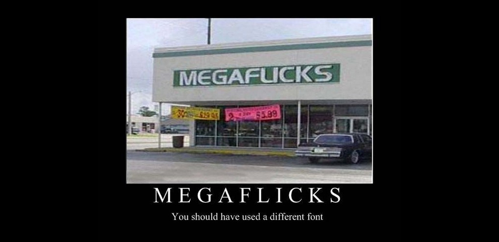
<moan>
Today is more of a personal gripe, about a tool that I use regularly to do the job I do (that’s testing stuff to make sure it’s not broken, in case you’d not twigged). A lot of the URLs I need to visit are loooooooooooooooooooooong – this is because they’re usually hosted on some staging site somewhere, or have additional parameters on the URL for me to be able to preview something, such as a particular variation on an A/B test. If you’re familiar with any A/B testing platforms, you’ll know this to be true.
Copying and pasting a URL string is fine, there is no room for messing up here, so often I can merrily be on my way and get to the URL I want with relative ease – but it’s not always the case that I can CTRL C and CTRL V a URL from one place into a browser URL bar. Let me give you an example:
Nearly all of the testing and QA work I carry out is done on a physical device – not on a cloud service like browserstack or crossbrowsertesting. The reasons for this would need another blog post (which I will get around to soon enough) but in my experience, testing stuff on a device in your hand is always the way to go. Imagine now, that you are testing something that is sat on a URL with 30 or 40 characters in it… am I going to spend my time painfully typing that in on a virtual keyboard? Nope, probably not. The error rate is too high, and to be frank, trying to fix an invalid URL with fat fingers on a touch screen is enough to drive anyone mad.
There are of course a couple of solutions around this – I could email the URL to myself on the device for example – but I don’t have email set up on the many testing devices that litter my desk on a daily basis. Another solution is to use a URL shortener, such as bit.ly or tinyurl. At least then I’ve only have say 10 characters to type in. This is a great solution, but today I realised there is a fundamental flaw in the product, for the way that I (and I assume others) may be using it.
It’s to do with fonts. And in particular how characters such as 0 (zero), 1 (one), O (capital o), I (capital i) and l (lowercase L) are displayed depending on the font you are displaying the text in. Lets take a look:
 Can you tell what is a 0 or an O or a 1 or an I or a l? No me either… and after several attempts at trying to get this URL correctly typed in a browser bar, I gave up. So where was I going wrong?
The only way to find out was to copy and paste the shortened URL into good old Notepad, which, not too unlike Houdini, revealed I was getting the characters mixed up.
 So what I assumed was a capital O was in fact a 0, and what I thought was a 1 was an I. No wonder I kept getting a “oh dear, you broke the internet page” when I tried to load the page.
The point of this post? Make sure you font choices are suitable for the task a user is performing – if someone needs to know if a 0 is 0 or an O is an O or a 1 is a 1 or an I is an I, or a l is a l and they don’t have the luxury of CTRL C or CTRL V – choose a font that doesn’t make it necessary for them to copy and paste something into notepad to figure out what characters are.
</end moan>

bit.ly uses the proxima-nova font to display it’s shortened URLs

Notepad uses the Consolas font – way easier to spot the character

Recent Comments