The Evidence
86% of homepages have low contrast text. I know this to be true because:
- Every website I audit has contrast problems
- If your users can’t read text correctly, then…
- They can’t read what you’re saying
- Complete actions you / they want to do
- Fix problems when they happen
Exhibit A:
Foreground & background colour
- Contrast needs to be sufficient but not overcooked
- The size, style & weight of the font affects contrast
- Provide controls for user agents that can modify colours
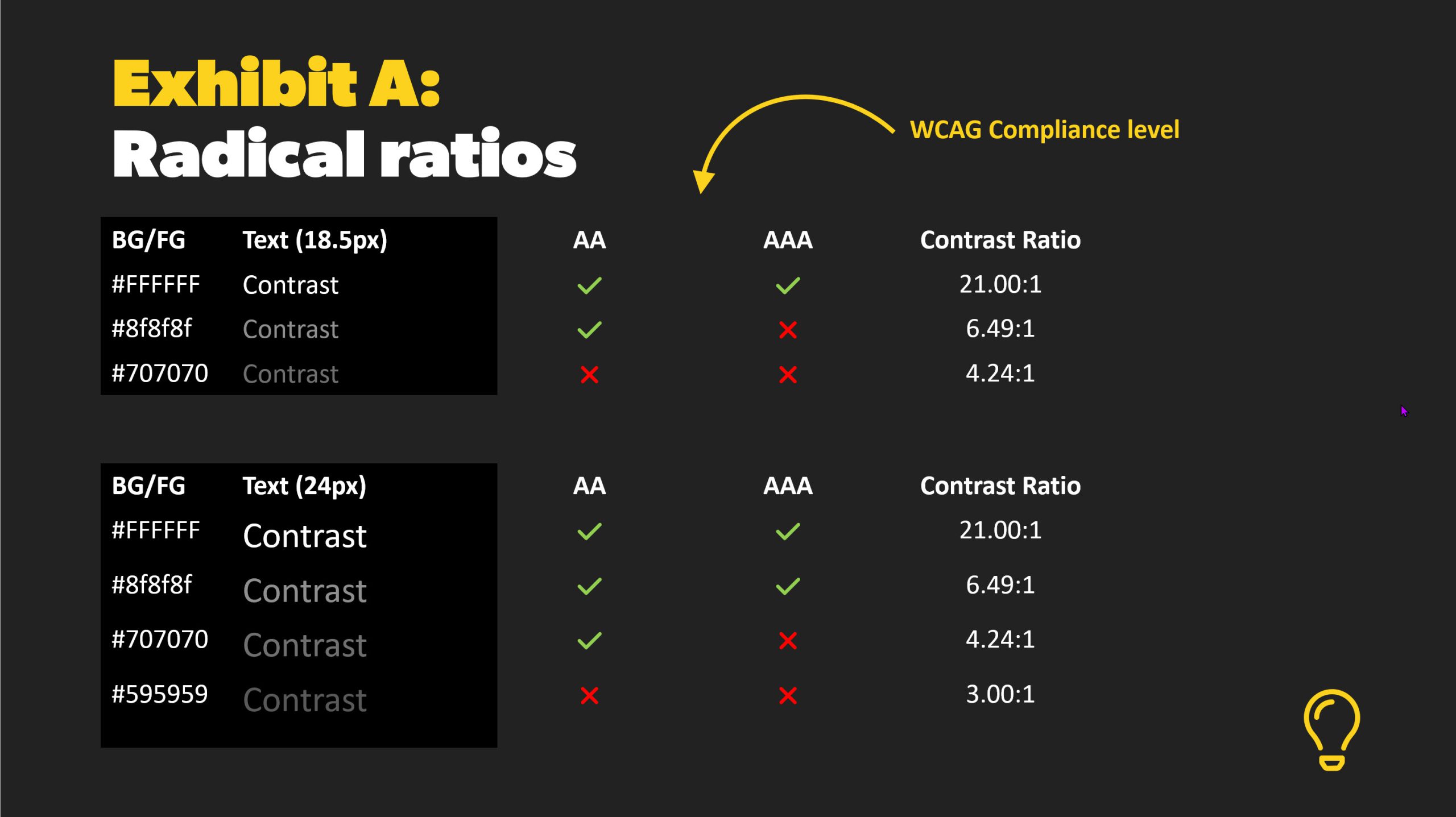
Exhibit B:
Font size
-
Use larger text
-
Aim for a minimum of 16px (1em / 100%)
-
Account for device pixel density
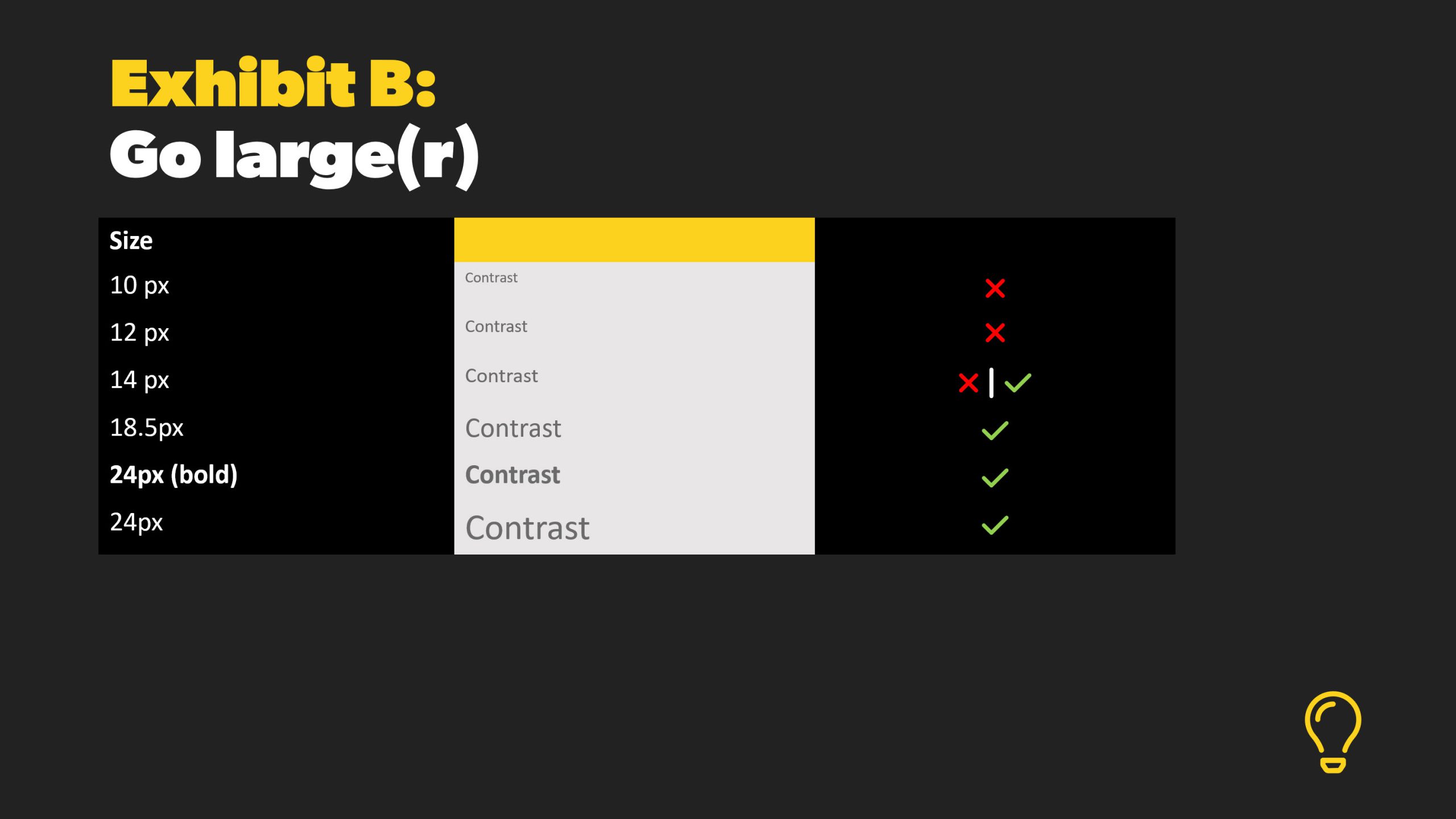
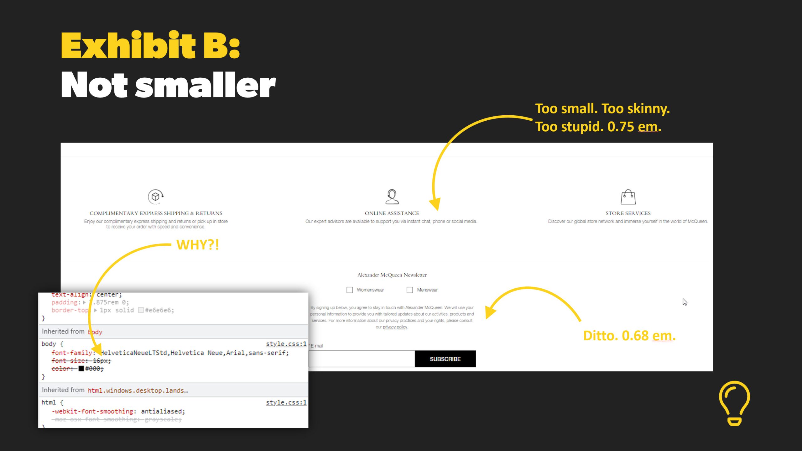
Exhibit C:
Font style
- Use fonts with wider character strokes
- Keep letter forms familiar
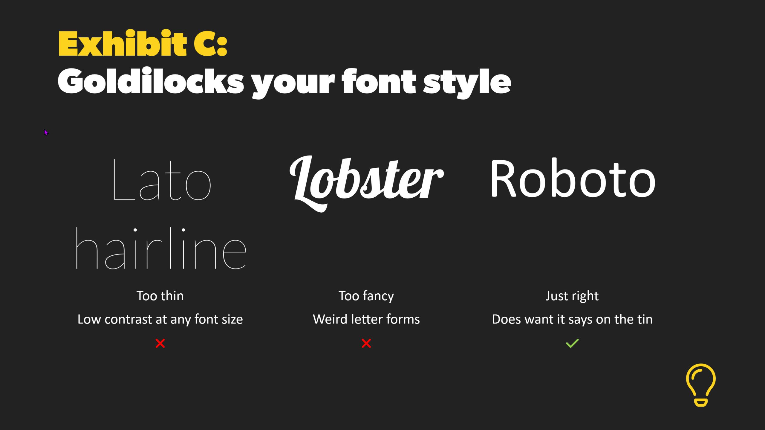
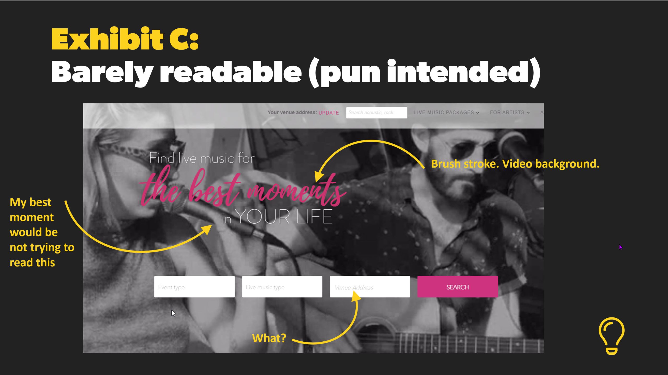
Exhibit D:
Text on background images
- Contrast usually sucks
- Can’t guarantee what bit of the background text displays on (resolution)
- Fubars your hierarchy
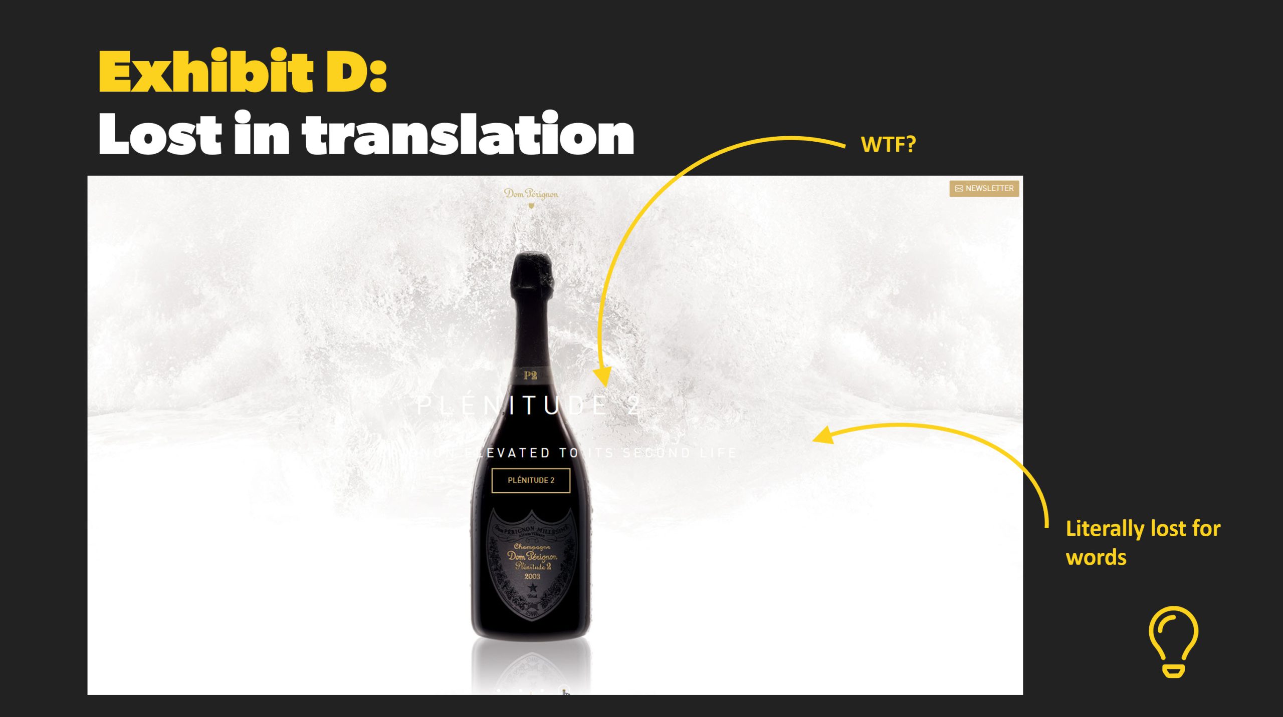
Exhibit E:
Graphical text
- Doesn’t scale nicely
- Users can’t modify colours
- Usually doesn’t translate correctly
- Contrast is normally poor
- Possible SEO impact
- Definite accessibility impact
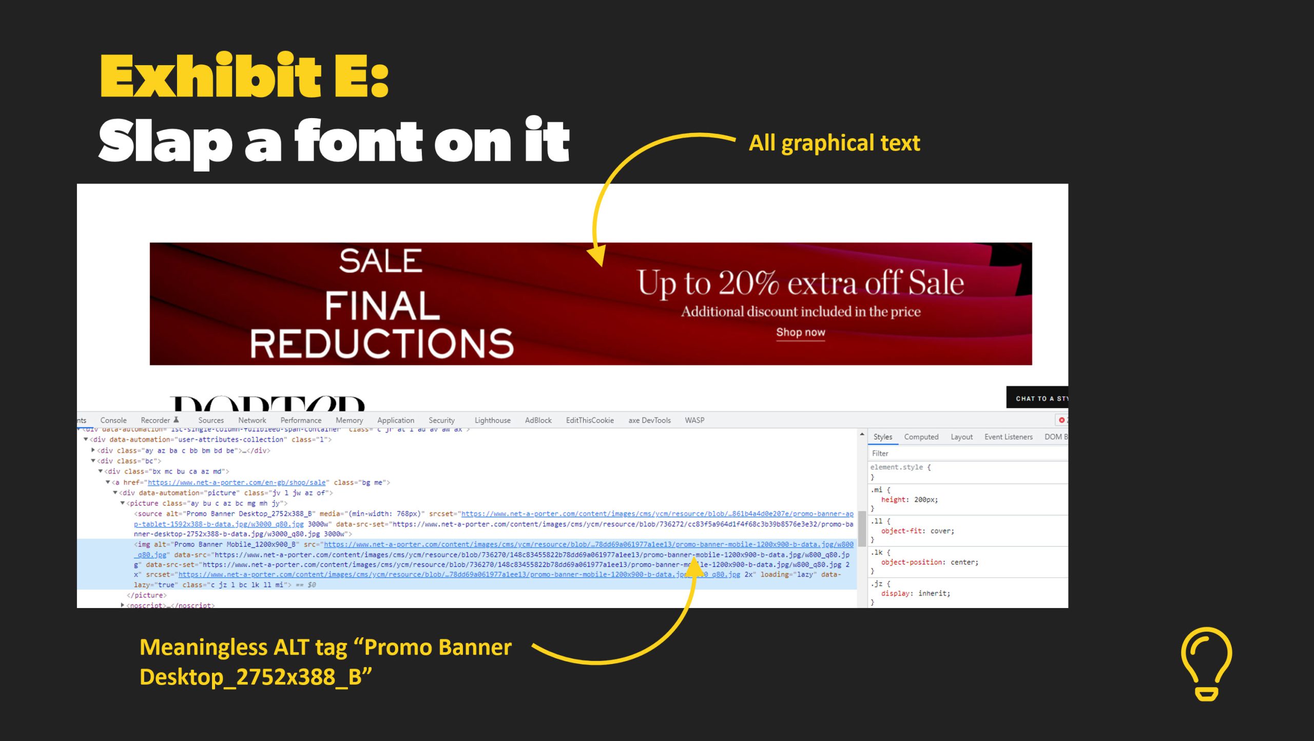
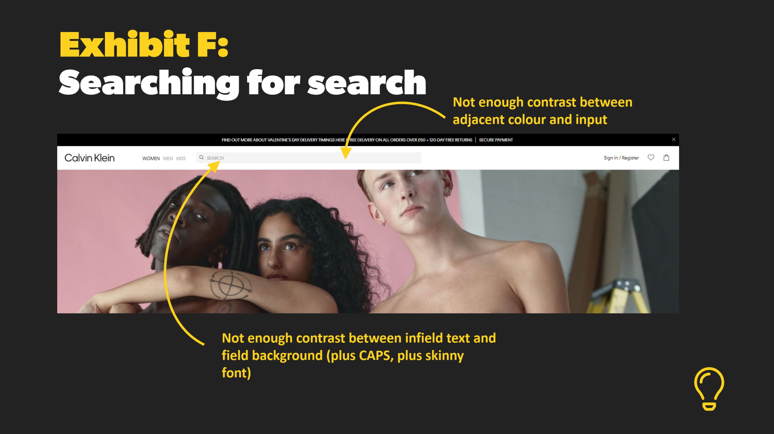
Exhibit F:
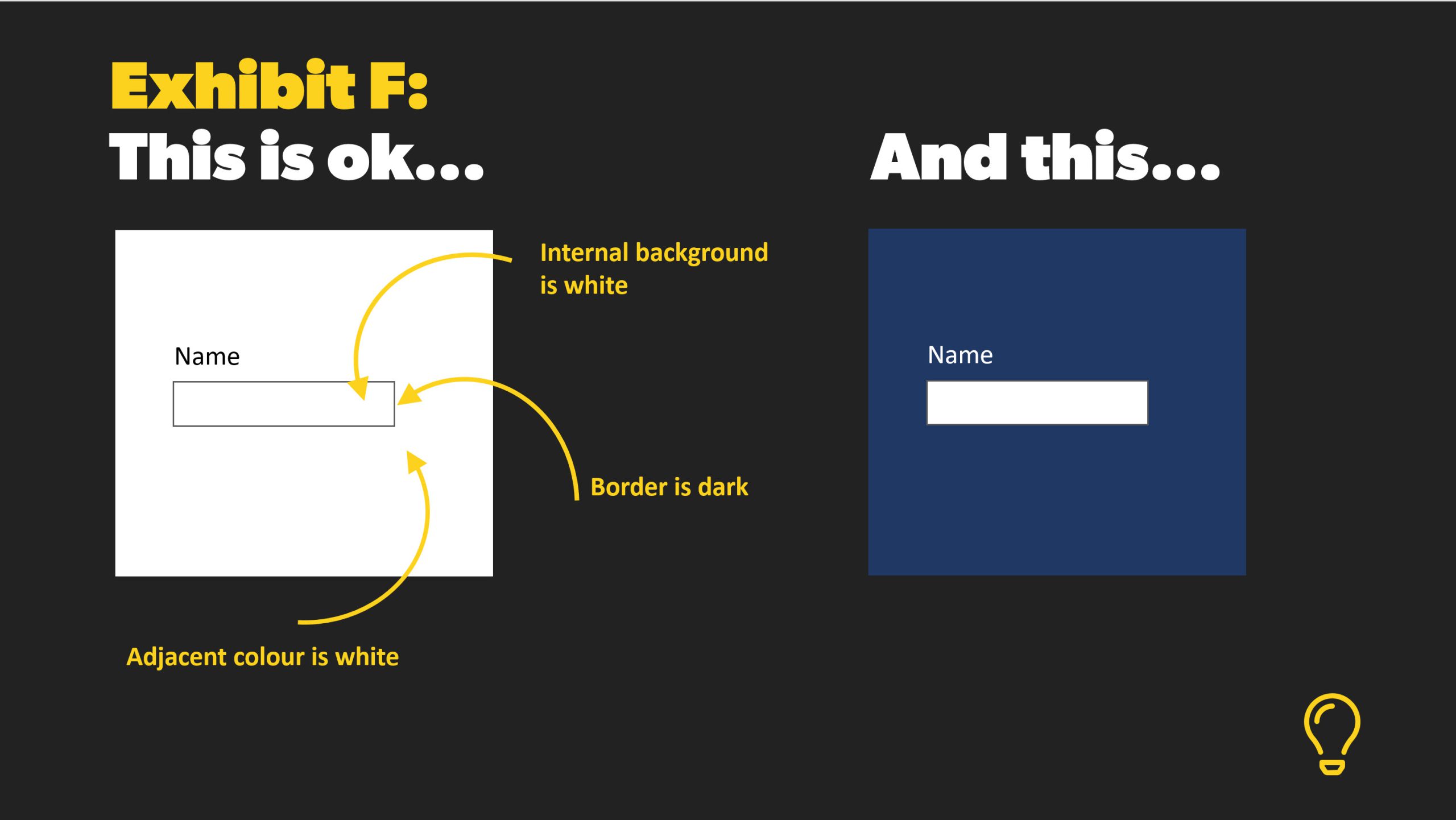
UI components
- Yes, contrast matters here too!
- Especially with adjacent colours
Sentencing
Aggravated assault on eyes
- Your colour guide should be determined by accessible guidelines, not opinion
- Your font choices should promote readability
- The right font will allow more colour combinations that still provide good contrast
Community service:
- Check your colour contrast ratios: webAIM contrast checker
- Install a browser extension to flag issues: here’s one or this
- Get a grip on non-text contrast: the lowdown
- Read up on everything contrast: WCAG contrast guidelines
- Educate those involved who are less enlightened

Recent Comments