The Evidence
Colour blindness affects 1 in 12 men and 1 in 200 women
- The colours YOU choose…
- Are not the colours that THEY see
- Which means your UI can’t rely on colour alone
- To make it intuitive and usable
Exhibit A:
Deuteranopia
- Most common form of colour blindness
- Limits ability to perceive green light

Exhibit B:
Protanopia
- Next most common form of colour blindness
- Limits ability to perceive red light

Exhibit C:
Tritanopia
- Rarer form of colour blindness
- Limits ability to perceive blue and yellow light

Exhibit D:
Monochromacy
- Rarest form of colour blindness
- Limits ability to perceive any colour

Mitigation
Give more clues
Use extra indicators to convey the meaning of something, not just colour

Mitigation
Use affordance
Make your UI elements look like they do something, or look like the thing they’re supposed to look like and function in an expected way.

Mitigation
Use sufficient contrast
Humans scan read, so make sure important things stand out against the noise.

Convicted: NY Times Wordle
I feel sorry for any colour blind user trying to fill in this wordle.

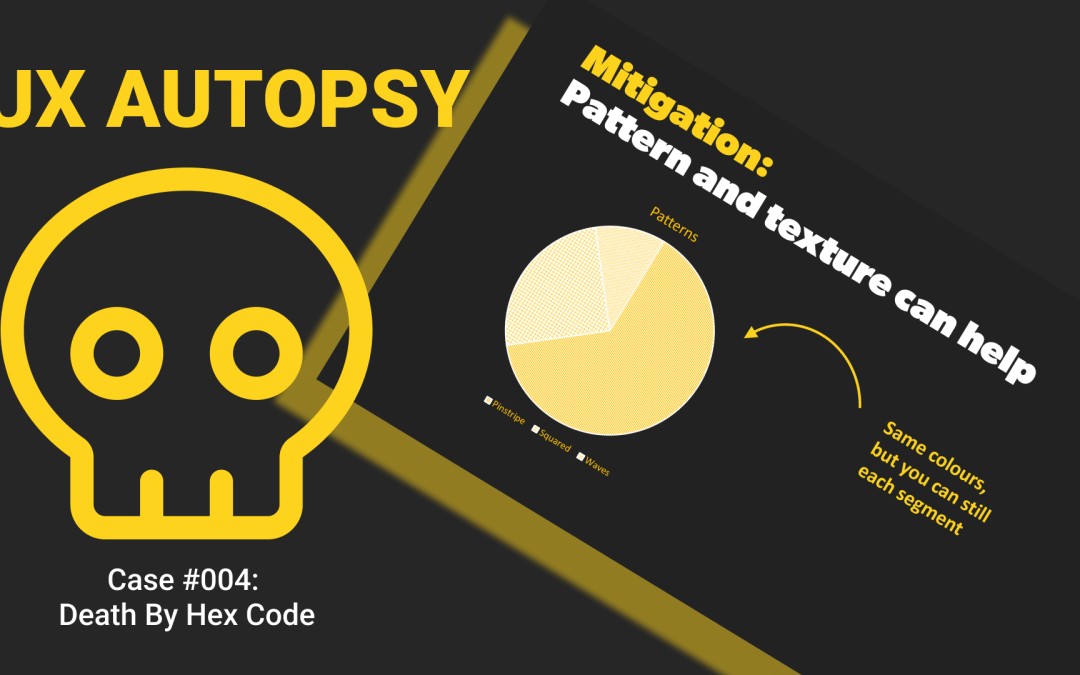
Mitigation
Pattern and texture can help
If you’ve a limited options of colours to use, you can utlise patterns and textures to differentiate information.

Mitigation
Avoid bad colour pairs
Be considerate of the colour groups you use and make sure that combinations of those don’t cause contrast and readability issues.

Mititation
- Limit your colour palette so that…
- It’s easier to design for colour accessibility
- Which means less chance of user confusion and…
- Less work for you!
Sentence:
Wanton abuse of colour palettes
- Some of your audience are colour blind
- Check your demographic split (male / female)!
- Your colour palette should accommodate them
- A limited colour palette doesn’t have to be a boring one
- Check your own eyes: Colour blind test
Community service:
- Learn about colour blindness: what is it?
- Check images: here is a tool
- Use Chrome dev tools vision deficiencies emulator: find out how
Recent Comments