The Charges
Using a calendar style date picker when asking a user to enter a date of birth is not the best option when it comes to user experience – not only for desktop but also for touch devices. Why you might ask, seems logical, use a calendar to choose a date doesn’t it? But think about it differently. If you were in the *real* world and filling out a paper form that required your date of birth, would you pull out a calendar to select and choose your date of birth? No! You’d just write it down, right? So why do we keep seeing calendars to enter a date of birth? It’s bonkers.
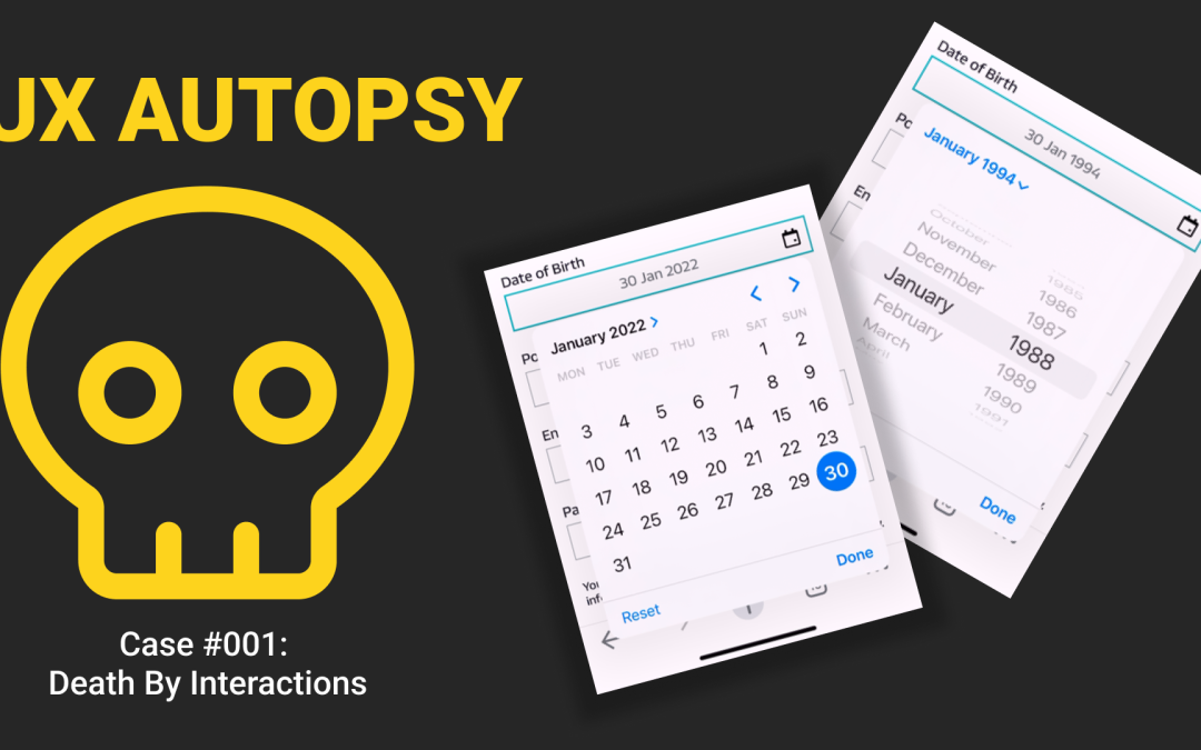
Evidence
This is a date picker shown to a user when they are required to enter a date of birth to register an account. The date of birth is required, due to the services being signed up for, so it’s a mandatory part of the sign up process, there’s no getting around it. Here’s some problems that immediately stand out from a usability point of view:
- The calendar starts on the current date. This makes no sense when there is a minimum age requirement (say 18). It should start at the earliest given date that would be valid to sign up for the service.
- It’s not explicitly clear what all the arrows do. There are 2 to the right of the overlay which may move the month back and forth. There is an additional one next to the MM YYYY title which may do something like allow you to choose from months and years. The issue is that there are no tooltips given to show the purpose of each of the arrows.
- Because of point 2 above, this type of UI has a high cognitive load from the outset.
- It also requires 13 interactions to find your DOB, and that’s assuming you were born on the same day as me 🙂

Mitigation #1: Use 3 Date Inputs
Removing the overbearing calendar and replacing with with 3 simple inputs (one for day, month and year) can immediately reduce the cogntive load for the user. There are no navigation systems to figure out or guess work as to what arrows do what function. It’s straight forward and easy to comprehend. Here’s how to implement this solution well:
- Always provide field labels that are persistent even if the input is in focus. This could be by placing the field label above the input, or having it contained within the input itself, but it must always remain visible.
- Remember to order the fields in the correct way for your audience – are they DD/MM/YYYY or MM DD YYYY types?
- For touch devices, always provide the correct virtual keyboard for the type of data you are expecting; in this case numeric.
- Provide error handling and messaging if entered data is out of bounds of the expected range (eg. 42/13/2100)
- This solutions requires just 11 interactions to complete the task

Mitigation #2: Use 3 Date Inputs + Auto Focus
The next level of awesome might be something like this, where you stick with the 3 inputs only with this implementation you auto focus the user to the next input once the previous has been completed successfully.
- Use the same rules as Mitigation #1
- This solutions requires just 6 interactions to complete the task

Mitigation #3: Use 1 Date Input
How about making it EVEN simpler? You can use just 1 date input and auto-format the data as it’s entered so you get it in the format you need
- Use the same rules as Mitigation #1
- This solution also requires just 6 interactions to complete the task
- The added benefit it provides much easier scanability for the user to check before they progress

Sentencing
Using a date picker (ie. a calendar interface) for date of birth entry is not good usability. The primary reason for this is that it doesn’t reflect the real world situation of entering you date of birth. It adds too much complexity (interactions, cognitive load) when there are far simpler solutions to choose from.
When ever you ask for a user to complete a form, the simpliest and most intuitive way is always the best. Here are some more good things to do:
- Provide persistent input labels, helpful tooltips, microcopy to add supporting reasons as to why data is required.
- Ensuring error messaging is inline and not post submit is a big winner
- Error messages should be written in a way that explains the issue and how to fix it
- Use the correct virtual keyboard for the type of data you’re expecting
- Ensure the “tab order” is correct, allowing desktop users to navigate fields using the keyboard (bonus points as this makes your form more accessible)

About The Author: Abi Hough
Founder UU3 / WeAreCorpus
Abi Hough is the founder of UU3 and WeAreCorpus. Through UU3, she works across UX research, optimisation, audits and digital strategy. Through Corpus, she explores the upstream web: the trust, proof, signals and contradictions that shape how humans and machines understand organisations before anyone reaches a website.
Recent Comments