Summary
A UX teardown of the applicant details section of the Indian visa form, covering cognitive overload, weak CTAs, duplicate tooltips, unclear labels and poor system status.
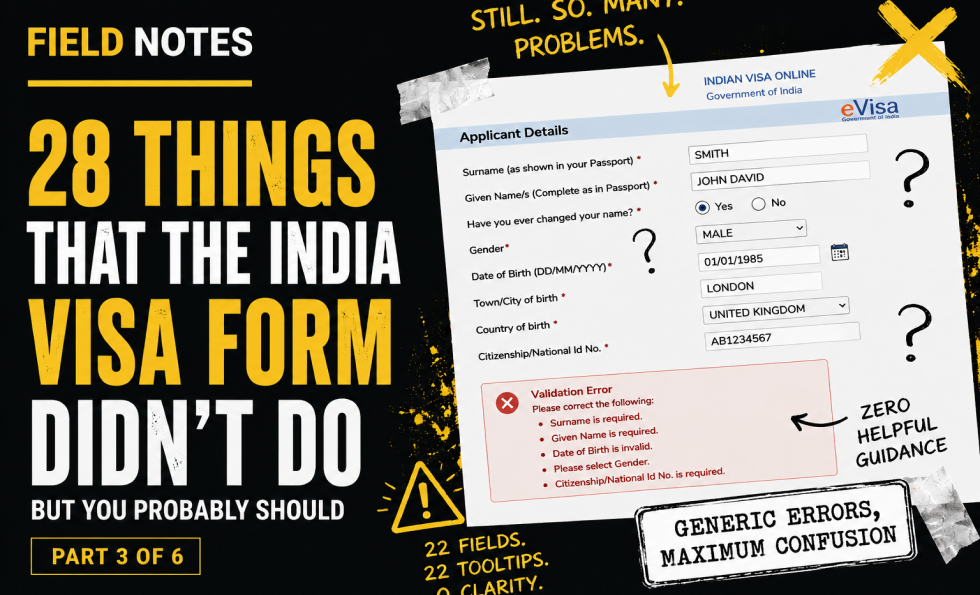
By part three, the user has somehow survived the first page and arrived at page two: applicant details.
This should be a structured, supportive part of the journey. Instead, it arrives as a wall of inputs: 22 labels, 22 fields, 22 tooltips and four CTAs. That is a lot to ask of someone who is probably already anxious about making one tiny mistake on an official application.
There are two save CTAs, which sounds good until you test them. “Save and continue” does not mean “save my current progress here.” It means “try to continue to the next step,” which triggers a sea of red errors if the page is incomplete. The label sets one expectation; the system delivers another. That is how trust gets chipped away.
The page also has weak system status. A “Data Saved” message appears, but it is barely noticeable and has no timestamp. There is no easy way to copy the application ID. Given the form already has an email address, an email confirmation with the application ID and resume link would be far more useful.
Tooltips are another problem. Many repeat the label rather than adding useful information. If a tooltip does not clarify, explain, reassure or prevent an error, it is just decorative noise wearing a tiny hat.
This section also raises deeper content and inclusion issues: unfamiliar name terminology, unclear changed-name fields, gender options, religion, visible identification marks, educational qualification language, and radio controls pushed out of visual alignment.
The core issue is not just “too many fields.” It is too many fields without enough structure, control, clarity or recovery.
Key field notes
-
Break long forms into smaller, meaningful sections.
-
Save buttons must do what users expect them to do.
-
System status should be obvious, timestamped and useful.
-
Tooltips should add information, not duplicate labels.
-
Users need control to navigate back and correct earlier answers.
-
Sensitive or culturally variable fields need careful labelling and response options.
Best for
Long forms, cognitive load, form navigation, system status, tooltip design, inclusive form design.
Background
This piece sits alongside Abi’s wider work on UX, usability and trust because it shows how small interface decisions can create large confidence failures. A complex form is not just a sequence of fields. It is a promise that the organisation can handle sensitive information clearly, safely and competently.
The India visa form is especially useful as a field note because the stakes are high. Users are not casually browsing. They are trying to complete an official task, avoid mistakes, protect personal information and understand what will happen next. Every unclear label, broken interaction, missing explanation or failed recovery path adds doubt.
It also connects to the Corpus view that trust breaks when claims, reality, proof and interface behaviour do not line up. In this case, the form itself becomes the evidence. If the experience is confusing, inaccessible, inconsistent or hard to recover from, the user learns something about the organisation long before they finish the task.
This third post focuses on cognitive load, save behaviour, system status, tooltips and the cost of presenting too many fields without enough structure, guidance or recovery.

About The Author: Abi Hough
Founder UU3 / WeAreCorpus
Abi Hough is the founder of UU3 and WeAreCorpus. Through UU3, she works across UX research, optimisation, audits and digital strategy. Through Corpus, she explores the upstream web: the trust, proof, signals and contradictions that shape how humans and machines understand organisations before anyone reaches a website.
Recent Comments