Summary
A UX teardown of the passport details section of the Indian visa form, covering date entry, input sizing, conditional logic and the unholy crime of expiring a session without warning.
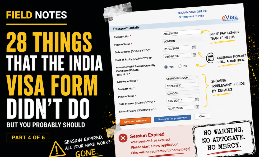
Part four moves into passport details.
On paper, this should be one of the more predictable sections. Most users have a passport in front of them. The form needs the number, place of issue, issue date, expiry date, and any relevant additional passport or ID information.
And yet.
The passport number field is one of the few that mostly behaves. Even there, the input could be better sized to match the expected data. The field is much longer than needed, despite passport numbers having known format constraints. Inputs should help users understand the expected size and shape of the answer.
Date of issue and expiry date use calendar pickers again. This is still not a good idea. For dates far in the past or fixed dates printed on a document, three simple text inputs are usually faster, clearer and less irritating than forcing users through a date picker.
The “Other Valid Passport/ID” section shows all fields by default, even though they only apply if the user selects “yes.” This adds irrelevant information before the user has made the choice that makes it relevant.
Then comes the real crime: session expiry.
After spending time completing the page, the user clicks to save and continue, only to be told the session has expired. There is no warning. No autosave recovery. No meaningful explanation. No way back into the form. The user is sent back to the homepage.
This is where friction becomes contempt.
Long forms must respect user effort. If a session can expire, warn the user. If the data matters, autosave it. If the user is interrupted, provide a recovery path. Anything else is just administrative cruelty with a submit button.
Key field notes
-
Size input boxes according to expected data length.
-
Use consistent input patterns.
-
Avoid calendar pickers for fixed historical/document dates.
-
Hide irrelevant conditional fields until needed.
-
Warn users before session expiry.
-
Autosave and recovery are not luxuries in long official forms.
Best for
Session timeout UX, passport forms, date input design, conditional logic, error recovery.
Background
This piece sits alongside Abi’s wider work on UX, usability and trust because it shows how small interface decisions can create large confidence failures. A complex form is not just a sequence of fields. It is a promise that the organisation can handle sensitive information clearly, safely and competently.
The India visa form is especially useful as a field note because the stakes are high. Users are not casually browsing. They are trying to complete an official task, avoid mistakes, protect personal information and understand what will happen next. Every unclear label, broken interaction, missing explanation or failed recovery path adds doubt.
It also connects to the Corpus view that trust breaks when claims, reality, proof and interface behaviour do not line up. In this case, the form itself becomes the evidence. If the experience is confusing, inaccessible, inconsistent or hard to recover from, the user learns something about the organisation long before they finish the task.
This fourth post looks at passport details, input design, conditional fields and the particularly feral decision to expire a user’s session without warning or useful recovery.

About The Author: Abi Hough
Founder UU3 / WeAreCorpus
Abi Hough is the founder of UU3 and WeAreCorpus. Through UU3, she works across UX research, optimisation, audits and digital strategy. Through Corpus, she explores the upstream web: the trust, proof, signals and contradictions that shape how humans and machines understand organisations before anyone reaches a website.
Recent Comments