
Summary
A UX teardown of the final page of the Indian visa form, covering server errors, locked pre-filled answers, broken searchable dropdowns, unclear terminology, defaults and missing recovery paths.
Part six reaches the fourth and final page of the form.
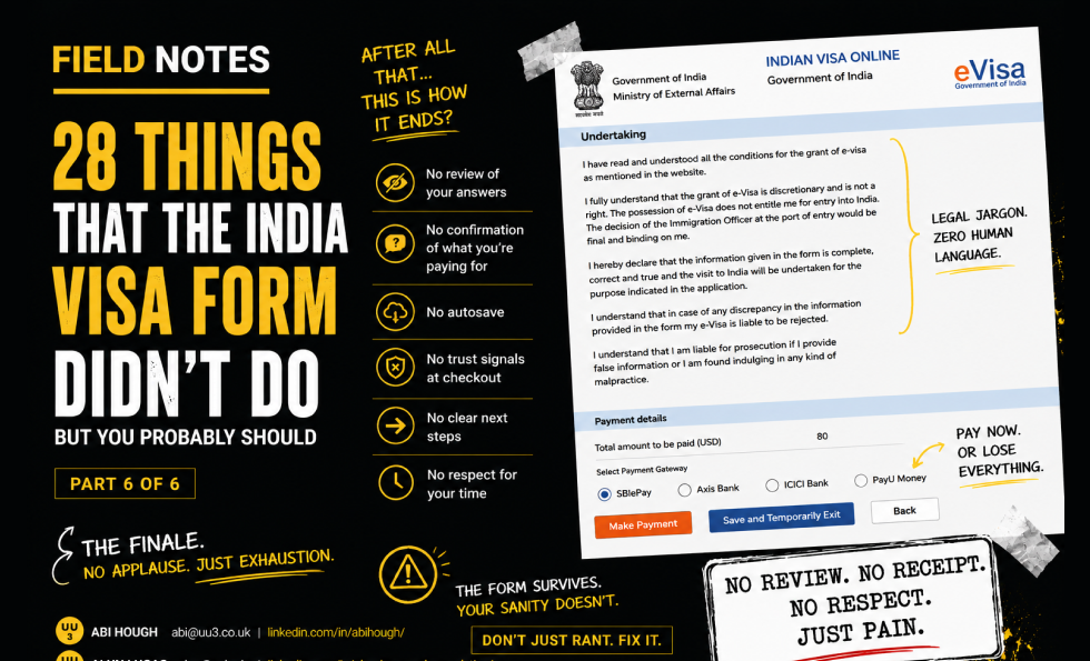
And what does the user get after surviving everything so far? A possible 500 server error or 404 page not found error. The system does not clearly explain what happened, why it happened, or how to recover the form. The safest guess is to start again, which is exactly the sort of thing that makes people consider never leaving the country.
Once back in the form, the visa service is prefilled from an earlier selection. Good in principle. Bad in execution. The user cannot change it. There is no proper navigation back to page one. The choice is effectively set in stone unless the user risks the browser back button.
Places to be visited are split into two fields because each has a 35-character limit. That may technically work for some applicants, but it is a clumsy way to collect destination information. A type/find/select pattern would be more useful than forcing users to ration characters like wartime butter.
Some parts show promise. The hotel/resort question is a useful qualifying question and does not show irrelevant information until needed. But if the answer is “yes,” the user should have been told at the start that this information might be required.
Other sections are less charming. Entry type is pre-filled as “Double” and cannot be changed. Previous visa information appears based on assumptions. “Control No.” is unexplained. A country dropdown is finally searchable, but the search result cannot actually be selected. SAARC is explained as an acronym but not as a usable list until after the user has already had to answer a question about it.
Then there are the additional questions, all defaulted to “yes.” This may be intended to force explicit action, but the effect is hostile. The interface appears to assume the worst of the user before they have done anything. Worse, the promised details field only appears if the user changes the answer away and back again.
The final page is a perfect summary of the whole journey: weak recovery, locked answers, broken functionality, unclear terminology, poor defaults and missing “what if” paths.
Key field notes
-
Error pages should explain what happened and how to recover.
-
Pre-filled answers must be editable where user correction may be needed.
-
If complex information is required, tell users before they start.
-
Searchable dropdowns must actually work. Revolutionary, apparently.
-
Explain unfamiliar terminology before asking users to act on it.
-
Do not use hostile defaults unless there is a strong reason.
-
Always design for “what if?” scenarios.
Best for
Error recovery, form defaults, complex application journeys, public sector UX, conditional logic, QA.
Background
This piece sits alongside Abi’s wider work on UX, usability and trust because it shows how small interface decisions can create large confidence failures. A complex form is not just a sequence of fields. It is a promise that the organisation can handle sensitive information clearly, safely and competently.
The India visa form is especially useful as a field note because the stakes are high. Users are not casually browsing. They are trying to complete an official task, avoid mistakes, protect personal information and understand what will happen next. Every unclear label, broken interaction, missing explanation or failed recovery path adds doubt.
It also connects to the Corpus view that trust breaks when claims, reality, proof and interface behaviour do not line up. In this case, the form itself becomes the evidence. If the experience is confusing, inaccessible, inconsistent or hard to recover from, the user learns something about the organisation long before they finish the task.
This final post looks at how the journey ends: server errors, locked pre-filled answers, unclear terminology, hostile defaults, legal-heavy language and weak recovery paths at the point where the user most needs confidence.

About The Author: Abi Hough
Founder UU3 / WeAreCorpus
Abi Hough is the founder of UU3 and WeAreCorpus. Through UU3, she works across UX research, optimisation, audits and digital strategy. Through Corpus, she explores the upstream web: the trust, proof, signals and contradictions that shape how humans and machines understand organisations before anyone reaches a website.
Recent Comments