Summary
A UX teardown of the Indian visa application journey, starting with first impressions, trust signals, outdated design cues and the moment a legitimate form starts to feel suspicious.
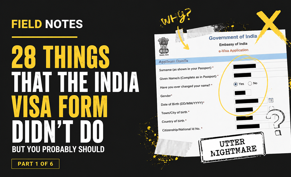
The Indian visa form journey begins before the form itself.
A user starts with a simple question: what documents do I need to travel to India? They find the GOV.UK guidance, follow the e-visa link, and land on what should feel like a safe, official, trustworthy application experience.
Instead, the first impression is… not ideal.
The page immediately raises doubts. Scrolling header text. A “last updated” date from 2019. A browser compatibility notice that feels like it escaped from a museum of abandoned intranets. Helpdesk phone numbers and email addresses presented as images, meaning they are not clickable. Unclear wording. Weak hierarchy. A primary application CTA that does not behave like the most important action on the page.
This is not a cosmetic issue. It is a trust issue.
When a form asks for highly sensitive personal information, the interface has to reassure people that they are in the right place, that the process is legitimate, and that their information will be handled securely. If the page looks suspicious, users do not experience “quirky retro charm.” They experience risk.
The lesson here is brutal but simple: first impressions count. A form can be technically legitimate and still feel untrustworthy if the signals are wrong.
Key field notes
-
Poor presentation erodes trust before the form begins.
-
Outdated information makes users question whether the service is still maintained.
-
Security reassurance matters when sensitive data is involved.
-
Primary actions need clear visual hierarchy.
-
Copy should be tested with the audience, not written like a haunted government cupboard.
Best for
Form design, public sector UX, trust signals, service design, accessibility, conversion friction.
Background
This piece sits alongside Abi’s wider work on UX, usability and trust because it shows how small interface decisions can create large confidence failures. A complex form is not just a sequence of fields. It is a promise that the organisation can handle sensitive information clearly, safely and competently.
The India visa form is especially useful as a field note because the stakes are high. Users are not casually browsing. They are trying to complete an official task, avoid mistakes, protect personal information and understand what will happen next. Every unclear label, broken interaction, missing explanation or failed recovery path adds doubt.
It also connects to the Corpus view that trust breaks when claims, reality, proof and interface behaviour do not line up. In this case, the form itself becomes the evidence. If the experience is confusing, inaccessible, inconsistent or hard to recover from, the user learns something about the organisation long before they finish the task.
This first post focuses on the earliest trust signals: what the user sees before they enter any information, and how quickly an official service can start to feel suspicious when presentation, hierarchy and reassurance are weak.

About The Author: Abi Hough
Founder UU3 / WeAreCorpus
Abi Hough is the founder of UU3 and WeAreCorpus. Through UU3, she works across UX research, optimisation, audits and digital strategy. Through Corpus, she explores the upstream web: the trust, proof, signals and contradictions that shape how humans and machines understand organisations before anyone reaches a website.
Recent Comments